Showing posts with label Goldwork. Show all posts

Tuesday, April 24, 2018

Knife Sheath - The Embroidering Part 1

 The first order of business is to outline all of the parts that are going to have silk shading. This involves a lot of flipping the frame over to make sure I'm on the lines, but it means I can ignore the back for the actual shading part.
In this picture to the right you can see that I chose the colors for the flowers to match the original piece without taking into account that the background purple is very different. I'll be making some adjustments when I move onto the shading. But in person these lines show up plenty to give me guidance.

Here you can see the back of the piece and how I tacked the linen with the pattern on it to the back of the silk. There's actually another piece of linen in between, because the linen was so thin. You can also see that in the end I changed the pattern at the point of the sheath. I was having a hard time fitting all the motifs, so I dropped the tulips from the design. I'll need to decide on something small to put there later.

Once everything was outlined it was time to start my favorite kind of embroidery - silk shading! I used a few different similarly sized silks (primarily Splendor, though) because that's what I had in the colors I needed. I closely followed the original coloring, but I think either the threads I'm using are slightly finer, or the images are larger. It's difficult to know scale from the pictures that are available, unfortunately.


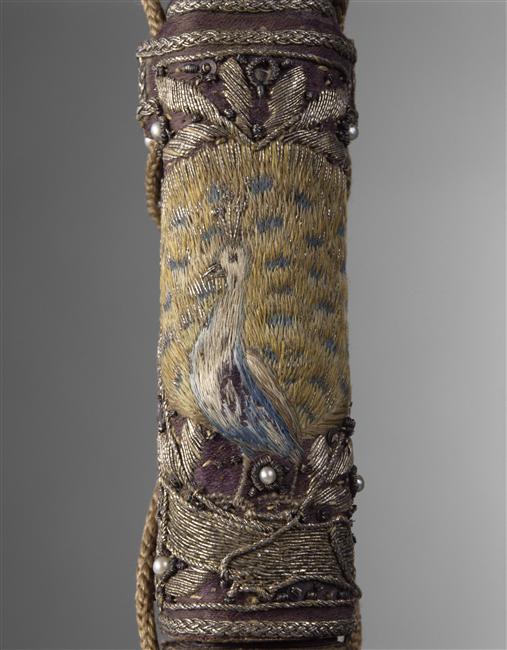
Here the left flower (minus stem) and laurel leaves are finished, and the peacock is well on his way.
I was originally going to put more shading into the laurel leaves, but people seem to like them a lot as is, so I've decided not to mess with success in this instance.

Next I'll be finishing the peacock and the right flower, before moving on to birds and stems.

Monday, April 23, 2018

Knife Sheath - The Planning


When my good friend Elaina was given her write for the Laurel, I realized that I was pretty Booked Out. I still definitely wanted to make something to celebrate her accomplishments, though. I figured she would be very supportive of me using her as an excuse to start my next real A&S project. And so!

For catalogue information, see 1962-58-11-a,b.
https://collection.cooperhewitt.org/objects/18705973/
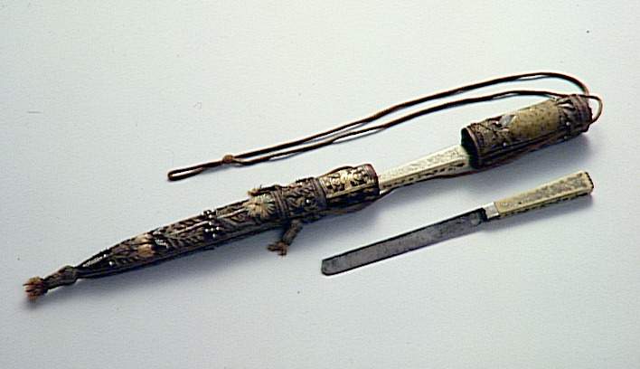
I'd been looking at the concept of Wedding Knives for some time. Pretty embroidery and sharp objects all at the same time? Sign me up! It was an Elizabethan era tradition to give a newly married couple (or seemingly, just the new wife) a pair of table knives in a fancy case. Also during this period people had cutlery cases that were similarly decorative.
Cutlery from Queen Elizabeth

British Museum


Elaina had decreed that she wanted her vigil to be based on a 17th century Italian wedding reception. It just so happened that while I mostly have evidence of the English doing this particular tradition, I also have one knife sheath that is from Venice. And it also just so happened that is was my favorite.
https://www.photo.rmn.fr/archive/99-016973-2C6NU0X7YT91.html
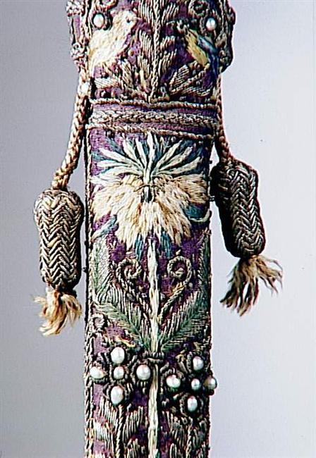
Just look at the gorgeous silk shading and gold work throughout. It's like it was made for me to make.
The pictures don't have closeups of every part of the sheath, so I've done some guesswork and some adjustments, but I tried to stay true to the original.
One of the motifs on the cover is a pelican in its piety (which I'll definitely have to remember for a future pelican) so I've replaced that with a laurel wreath.


Now, the hardest part of this for me was how to go about getting a sheath to cover. And knives. 
I decided for this timeline to cheat on those particular aspects, and instead create something that might get some more day to day use. I took a large wooden needlecase and used wood epoxy to expand it into a sheath shape, and then used that as the base for the embroidery. 
 To the right you can see the original needlecase, the expanded sheath, as well as the pattern I created. The molded sheath was far from symmetrical, so I draped some cheap cotton over it to make sure everything would fit ok. (Here's hoping that actually works in the end...)

The next step was to get the actual pattern. I sketched out the base pattern without using the weird shapes made from my drape first (on the right) and then I transferred that to the correct shape. I the traced it all onto some thin linen.
And then, because that linen would be backing the silk, I flipped the linen over and traced again, in order to get the design facing the right way. Now, with the linen basted to the silk, I could use the lines on the linen to determine my stitches, and hopefully never have to mar the silk at all. Unfortunately I did the final basting backwards and things are facing the other way anyway, but oh well!
All in all, I think I drew this pattern 5 times, though. So glad it's small.


Monday, January 8, 2018

Remy's Vigil Book - Finished Product

The long awaited (for no good reason) end to the saga of Remy's vigil book.

 I miscalculated on the width of the velvet, and so the edges that wrap around the book covers are a little shorter than is ideal. The cover is a bit prone to falling off. If it's annoying for him then I'll add some width to those. But hey, it also means that it's easy to take the cover off so he can use it like a normal book without worrying about being delicate with it, if he so chooses.

Thursday, August 31, 2017

Remy's Vigil Book - The Embroidering Part 4

The center of the book cover! While I was working my way through all the goldwork on the main piece, I was also traveling around with this centerpiece. I did not take nearly as many progress shots of this, but it was pretty straightforward.
I started with silk backed with linen (you can see the basting stitches in the lower left corner of the pictures). Because this is white fabric, I could actually put the design directly on the fabric! I sketched the heraldry with a normal pencil, knowing that I would cover all the lines. I then used __________ silk thread in split stitches and filled everything in. The only part that was any more complicated than that was the wolf - in order to stop it from being a blog, I did a bit of silk shading. It's still mostly split stitches, but there are a few stitches that are "whatever fit and moved in the correct direction".

Once the silk portion was done I couched silver passing thread around all the shapes. I didn't want it to be the only non sparkling part of the book cover! This was easy enough to do for the straight lines, but the wolf and fleur-de-lis were rather more difficult. I used tweezers to make particularly sharp bends in the thread where it was needed. I also used a slightly less thick passing thread for those areas.


When the embroidery was done it was time to applique this piece onto the main piece. Pinning it in place didn't work very well - it was very thick - so it ended up slightly lopsided. I used white and blue thread to do the couching, so it wouldn't show. I then couched a looped wire around the outside of the shield. This was to finish covering the couching, as well as to even out the slightly off center shield. I specifically used the looped wire because it called to mind the thread used for the oval of the original piece.

You can also see the many spangles that were added to the piece now. I followed the basic positions of the original piece, but primarily used them in particularly open places in the design. I attached the spangles by used a piece of check purl as a bead to hold them on, which is how they were done on the original piece. Some of the areas around the shield ended up somewhat open, but not in a shape that would easily accept a spangle. In those places I used just a piece of the check purl to fill out the design.

A critique that I've heard of my previous goldwork pieces is that they aren't quite encrusted enough with metal to be properly period. This is a very valid comment - the goldwork that I'm trying to recreate goes far above and beyond what might be considered "tasteful" in our time. Generally I didn't go far enough in the past due to time constraints. This time I was bound and determined not to have any large open spaces! The last two bits of work I had to do before covering the book were also to fulfill that goal.

The space under the swords had been taunting me for some time. I didn't know what I wanted to do, but it certainly needed to be filled. I ended up with a basic design and some spangles there, which turned out fine, but it taught me that the parchment paper I use to transfer my design does more than give me lines to follow. It also keeps the passing thread up above the pile of the velvet, making the lines stand out much more. Now that I know that I'll try to avoid last minute line additions to future projects.

The other item I added was a border. The original piece almost completely filled the cover of the book, and had a border that was actually around the edge of the book cover. In this case the book was slightly larger than the design area, so I decided to put the border closer to the rest of the design and leave the very edge of the cover undecorated.

And now we're essentially done, but it still needs to be put on the actual book!


Friday, August 25, 2017

Remy's Vigil Book - The Embroidering Part 3

With the passing thread and eagle done, it was time to fill in all the empty spaces with bullion.
The gold is the same stuff I used to fill in the majority of the eagle, and the silver differs only in color.
In the original piece the filling was done at a variety of angles. Most often it was a 45 degree angle to the motif, but sometimes it was a straight line across. The most notable of the second type is the wide curling leaves near each corner.

There's not too much to actually say about this step in the process. I find it to be the most pleasant step, although is it repetitive: bring the thread up on one side of the shape, cut the bullion to the appropriate size (the hardest part by far), bring the thread down on the other side of the shape. Repeat ad nauseam. It's meditative, and is very good at flinging little bits of metal everywhere.


I filled in all the gold first, and then all the silver. Then it was onto spangles, which will be in the next post (but you can see they snuck unto the last picture!)


Thursday, August 24, 2017

Remy's Vigil Book - The Embroidering Part 2

Once all of the passing thread was couched down it was time for the worst task: removing the paper used to transfer the design.
I have it down to a bit of a science at this point, but that doesn't make it terribly enjoyable. Using a chenille needle, scratch the paper to rip it. I start with the large open sections, and tear up whatever I can with my fingers once the needle starts the process. If you tear smoothly and slowly a lot of the lines will act as perforations and large chunks will easily be removed. (That part, at least, is satisfying). Next, I drag the needle along the lines in where the pieces are smaller, so they can be removed from the stitches without pulling on the threads too roughly. Once we get down to truly small pieces, tweezers are the way to go. I have some that are bent at the end have a thing and rounded end, so I can use them to poke and grab all sorts of things without damaging the stitches.
But oh, does it take awhile.
It's amazing the difference in how the piece looks once the metal threads are allowed to stand out on the velvet, rather than fading into the white paper, though.


The next item I tackled was the experimental portion of the project. I wanted to pad the Caliver's eagle with felt, which is far more complex a shape than any I've done before.
I experimented on some linen, trying different amounts of padding (all with gold colored felt) and different ways of laying the bullion down to get the right feather effect.
I ended up going with a method that had only the middle parts of the shape padded, with lots of unenclosed areas for feathering. This got a more curved effect than if I had tried to fill the entire shape with felt, and it also gave me some leeway on the edges where I couldn't completely fill the area.
Even with the reduced padding, I found it very difficult to fill the area. The curves were the hardest part - it was simply difficult to change the angles that way I needed to while still covering everything. And so, close up you can see that the bullion is cut quite irregularly, but I think the effect is fine when looking at it from a normal distance. It helps that the bird is maybe an inch and a half tall.
I do particularly like how the ends of the wings and tail worked. I like the little bits of a different bullion for interest, and that they really do end up looking feathery. The tail is also where the padding is most easily seen, unfortunately. I would reshape that if I were to do this again.


Monday, August 21, 2017

Pennsic 46 - A&S Experiences

Picture by Léonete d'Angely
I was convinced that I should display my works at the populace display this Pennsic, despite the fact that it overlapped with Rapier Champs this year. One of the big things that managed to push me over the edge was that my friend and fellow Handsome Boy was willing to babysit my precious books (and that others also volunteered for that task!)
I arrived early to set everything up. There was a non zero amount of running around because of forgotten items (oops) but the organizers had given us plenty of time (about 2 hours), which I very much appreciated.
At the suggestion of Mistress Vienna, I had business cards set out (Staples has one day printing, it was great!). I had also put out a book for comments, since I wasn't going to be able to actually hear those. I'll probably put out the book every time, now, because memories are good to have.
My display consisted of the two goldwork book covers I've made, with their documentation, as well as some test pieces that I did. The test pieces were there to be fondled and looked at, since the books themselves are somewhat delicate. I had many thoughts on how to make a better display from my A&S Champs experience, but all I managed to follow up on was a cloth for my space. My next display or competition I'll try to add one of the more complex things (right now, a step by step sampler that people can handle is highest on my list.)

Not shown: the piece of chocolate I immediately ate
I sat with my items for a little bit before everything opened, when the displayers were all wandering around looking at each others things. Then I went to fight in champs, and finally returned about 5 minutes before the display closed. But even in those 5 minutes I managed to have great conversations and heard many nice things! It was worth it just for that. I also returned to pile of tokens and several comments in my book, all of which were also heart warming. I didn't get to thank individual people, but know that if you stopped to look, I appreciate it.

There were a couple of amazing services that occurred concurrently with this display that I wish I could have partaken in. First, there was a team of artisans who gave their time to give feedback and advice to interested participants on a one-on-one basis. I hope many people took advantage of this, since it's absolutely the best way to improve - especially if you want to compete! There was also some people who were offering appointments for free macro photography of pieces. I would have signed up for this in a heart beat, since I find taking pictures of my work quite challenging. I have my fingers crossed that this will happen next year as well, and that I won't have a conflict for it.

And a class!

There were several embroidery classes that I had my eye on this year, but I was only able to make it to one of them. But it was a great class, and I learned a new goldwork technique! The class was taught by Vavara Laska doch' Koudelka from Trimaris, and it was about couching over a card. The class was coming from the direction of Russian goldwork, but many cultures have used cards to raise up their embroidery, and to get very crisp lines. I find it in ecclesiastical embroidery particularly often.
As is the way with classes, we didn't remotely get to finish the little project, but I think I have a solid understanding of the technique, and the handout is very detailed. The actual technique is pretty straightforward, although it takes some finesse to get exactly right.
Now to decide what to do with it!

Thursday, August 17, 2017

Remy's Vigil Book - The Embroidering Part 1

After finishing the design of the goldwork cover, it was time to start with couching down the lines. The lines were couched using #368 matte gold wyre from Thistle Threads and #5 silver passing thread from Hedgehog Handworks (now out of business). I happened to have both of these threads already, and chose them based on size and quantity, and the fact that I had bullion that matched their color. They were slightly different to work with. The silver was slightly thicker and acted more like metal wire would.
Sometimes I don't take the best pictures of my work, but hopefully you get the idea here.

The lines were somewhat complex to work with. In the original piece, there are two threads that are paired, but often have split apart to go create sub designs, to return to each other. Often they cross over themselves. In order to get all of that straight I printed out a very high resolution corner of the design, and drew arrows on it to follow. Even with one corner blown up to a full 8x11 page there were some more densely crossing areas that ended up being mostly guesswork.

Gold passing thread so close to completed
Because the lines were so complex I wasn't able to actual couch down both threads at once, when they were next to each other. I didn't have two spools of the thread, and couldn't begin to guess how long a second piece would need to be. Instead when separated thread returned to each other I tried to couch the second in the same places as the first, often going over both threads to give the illusion that they were couched at the same time.

Once I had completed all the gold portions - which amounted to four large motifs in the corners, and two smaller ones on each long side - I moved onto the silver. There was much less passing thread to worry about this time, and none of the motifs were particularly complicated. The flower petals were a bit of a pain due to the small loops crossing over each other and generally not wanting to go where I told them to, but it was still nothing compared to the gold motifs.

After the silver was done I outlined the last few objects with sewing thread, just so that I could find them once the paper was removed. This included the eagle, the central shield, and hilts of the swords. All of these were going to be more complicated that just outlined in passing thread, so couldn't be done over the paper.

All the passing thread

Sunday, August 13, 2017

Remy's Vigil Book - The Planning

Remy Delemontagne de Gascogne has a very late period, very French persona. When I was asked to embroider a vigil book for him I went on a quest for items that fit those two requirements.
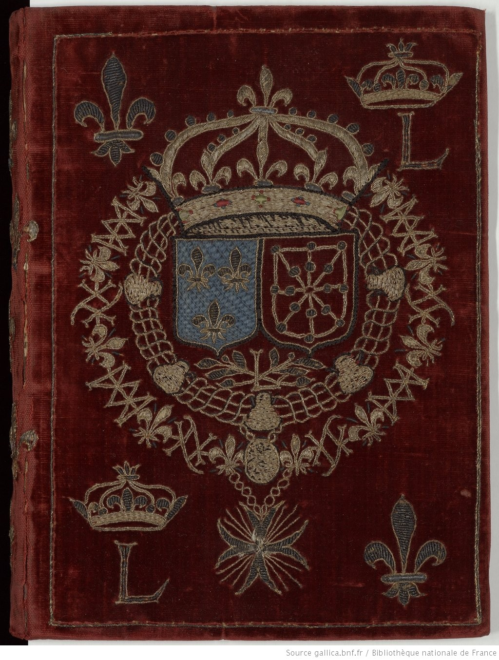
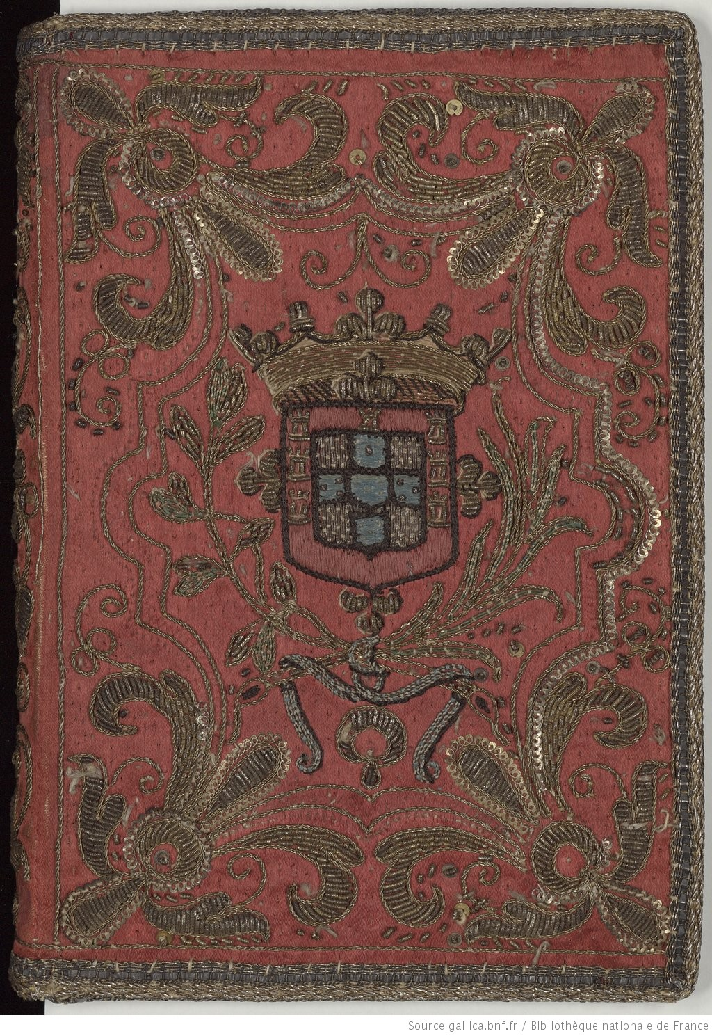
I found that the Library of France had some gorgeous book covers in EXTREMELY high resolutions.
Seriously, go visit. I'll wait.
The three embroidered covers that they had were all appropriate to the Cavalier period that Remy prefers. They're a little late for more common SCA A&S, but the style and materials were not appreciably different.

http://reliures.bnf.fr/ark:/12148/cdt9x1j51/?enhttp://reliures.bnf.fr/ark:/12148/cdt9xvg4/?en


http://reliures.bnf.fr/ark:/12148/cdt9x1jmm/?er=2
The purple one to the left is from 1637 ended up being the main source of inspiration. The original design was something that I knew I could add personalization to without too much effort, and without losing the original feel of the piece.

I knew that I needed to add the Order of Defense symbol. I also knew that I wanted to replace the religious imagery in the center with Remy's device. Other ideas that I floated around included the Musketeer symbol, the Carolingian heraldry, and the Carolingian Caliver's eagle. In the end, only the eagle made it into the design.


Both Carolingia and Remy have blue as their primary heraldic color, so I went on a search for blue velvet. I managed to get my hands on some amazing velvet scraps from fabric that had been used to create coronation garb for Thyra II and Edward III.
Similarly to previous velvet based projects, I stretched linen onto my frame and then basted the velvet on top of that so it could be stretched without being crushed. Then I traced the design onto parchment paper and basted that onto the velvet. I knew this would eventually result in the painful process of removing the paper, but it is so much easier to get the initial design down this way.
I tried to place the design so that I could use the selvage edge to make the covering process easier. This mostly worked, but I ended up with a book slightly larger than expected, so the end cover is just a smidge too small, and has a tendency to fall off. This is, luckily, a thing that can be fixed.


Monday, March 6, 2017

Queen's Order of Courtesy Glove

There was a call put out to the East Kingdom populace for more award medallions. Our royals have had a low stock on several awards for quite some time now.
One of the awards they needed more of was the Queen's Order of Courtesy. It happens to be particularly suited to embroidery, and so I set out to make one.


I embroidered the rose on linen using flat silk, mostly in satin stitch. I then appliqued the rose onto a white glove, and outlined it with silver passing thread.
I gave it to the Queen at K&S A&S and Bardic, and I think it went out in court that day!
More QoC gloves are in my future, I'm sure.


Monday, November 14, 2016

Peerage Cloak - Finished

It only took a few months.Well. At least it didn't take a full year.
Back in February I started planning a piece that would go on a peerage cloak. The recipient already had the peerage (and two more!), he just wanted to add the Order of Defense symbol to the cloak that displayed his Pelican and Knighthood. He also wanted it to be shiny.
I'd gotten somewhere in April, but as so often happens things came up, and I had taken on a project a bit more time consuming than I expected ( I would never.)

So we swing around the fall, and I decide that this cloak is getting done in time for the Rapier K&Q tournament, which lights a fire under me.

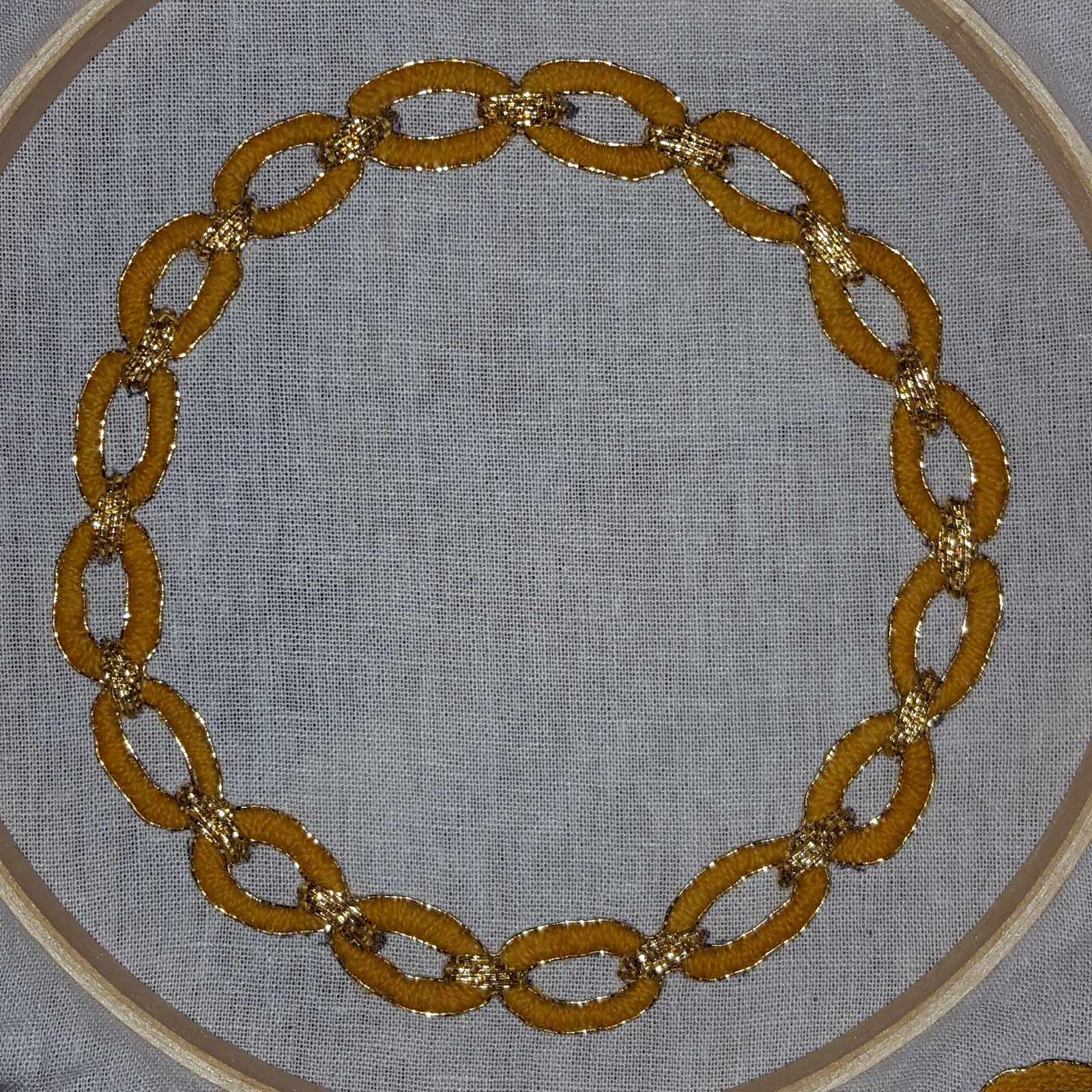
In the last post, so long ago, I had decided how I was going to create the chain. I was still a little worried that the wool would look unfinished next to the gold thread, but once I had the outline in place I think things really came together. And if I had tried to do the whole thing gold I think I would still be cursing about this project sometime next year.

Next I sketched in the swords. Even though my plan was to applique the swords on separately, I wanted to make sure they were the right size, so I just embroidered them directly inside the chain. I left off the extra fiddly details - the cross guards and swept hilts. There was no way I was going to be able to applique something that thin, so those were going on afterwards.
In hindsight, I think I should have just done the swords entirely on the cloak. I was trying to avoid pokey bits on the inside of the cloak as much as possible, and also trying to not carry around 20 lbs of fabric when I could help it, but I don't think it saved me any real time.

At this point I cut everything out with tiny scissors, leaving about a quarter inch of fabric around the edges. Then I spent so much time fray checking the back and tucking in all those edges. (So Period!) Because the edges were so narrow and the linen so fray-y, in that way only linen can be, I didn't trust things to not unravel if only the applique were holding it together.
I think this made the actual applique easier, but I'm not really sure.
The swords were thin enough that they were a real pain, and there wasn't enough embroidered material to fully cover the white on the edges. So in addition to adding the small details, I went around all the borders in a matching red wool. From a distance I don't think you can tell it's there, other than that the lines look much cleaner.
The sword blades are wobblier than I would like, but straighter than some other straight lines I've done in goldwork. Overall, once it's worn, I'm happy with the effect. Trying to take a nice picture of a pile of wool turns out to be kind of difficult.
Of course, I don't have a picture of it being worn, so you'll have to take my word for it for now.

I'm super excited to have this done and in the hands of its owner, and I learned a lot for next time.


Tuesday, July 12, 2016

Vigil Book for Matthias

It's been a busy summer for me!
Once again I was asked to create a vigil book cover - this time for a friend who was getting his Knighthood!

The original design was based on the motifs that were going on a new tunic, also for the occasion. Those motifs were in turn based on the sorts of designs you would often find in German brick stitch as well as Austrian roof tiles.
Image from A Stitch Out of Time
The belt was an obvious choice, this being a knighting and all. No part of me wanted to try to embroider a unicorn in the time allotted to me, so my initial plan was to include shooting stars. Unfortunately I started to run out of time, and ultimately I was worried they would make things too busy, anyway.


I knew purple was a requirement for the ground fabric. I found a wonderful linen - thin enough to make a good cover while still hefty enough for the heavy embroidery I had in mind.
Because of the geometric nature of the design I decided to draw onto parchment paper so I could the lines exactly correct. It was, as usual, a pain to remove, and I'm not certain this time if it was the right route. It's harder to remove the paper from linen than it was from velvet or wool, where the pile helps get the paper off.

All the embroidery is silk - for the belt I used a few shades of Splendor, and the geometric portions were done using a thicker pearl thread that I got at Gulf Wars last year.
Non metal embroidery completed

Silk shading and gold work, while often found together, are not often found with German designs (that I've found. I admit I haven't looked very hard), but I thought it would look good - and would be an easy (in that I'm practiced at those methods) way to get a good looking book.

I'm very happy with how the shading came out - considering I only used three colors, I was worried it would end up too rigid looking. The belt did come out a little...non euclidean. I would change the shape of where it wraps around itself if I went back to do it again.

The biggest problem that I had with this was that the frame wasn't holding the center of the piece as tight as I would want. I had to retighten if regularly, and I still ended up with a lump in the middle of the belt, which you can see in the finished picture below.


For the goldwork I used passed thread as the buckled and the bits inside the geometric areas. I'm very happy with how the buckle came out. The gold on the end of the belt is pearl purl, slightly stretched out. I was originally planning on using normal purl or bullion for that area, but I didn't have any with quite the right color gold to match the passing thread I used. I like the effect, so I'm ok with making the last minute change.
It doesn't really show in the pictures, but the entire belt is outlined in a very thing wire twist, including inside the holes. I think this is most apparent in that the belt seems more smooth in the the final picture than with just the needle painting done.

And finally, the finished product!