Showing posts with label Book Cover. Show all posts

Friday, February 23, 2018

Thyra's Vigil Book

This latest book was made for Duchess Thyra as she was inducted into the Order of the Laurel. It was a lot of fun to do! After my foray into counted work, I retreated back into my love of shading and color for this book.

Thyra is a well know scribe who makes absolutely amazing scrolls, but I think many people outside of the dance community don't know about the passion and joy she brings there, as well. My goal was to make sure her book brought that aspect of her arts forward in people's minds.
I, of course, know nothing about dancing, so I looked to another expert: Philip White. He pointed me to a large variety of resources with many gorgeous images. The only downfall was that all of the images were people. Embroidering a person seemed like a lot of commitment.
(I'm sure you can guess where this goes.)

After some more searching around and back and forth with Philip, I decided that the first images he sent me were the best for my purposes. These were from Arbeau's Orchesography. The man on the right was chosen because apparently the move he's doing (a capriole) is one of Thyra's favorites. The woman on the left was because I wanted symmetry, and a woman, and there wasn't a whole lot of choice. There didn't seem to be any images women being active, which I'm sure could fuel a whole thesis.


The Felbrigge Psalter
Opus Anglicanum example, with split
stitch shading and underside couched goldwork
The arrangement of the cover is very loosely based on the Felbrigge Psalter, in that there are two figures interacting with each other with split stich shading used to embroider then. The laurel and heraldry are pretty serious deviations from the design, and are included because it's a vigil book. I chose this style of embroidery because I associate Thyra with the 14th century (for no real good reason, I admit) and split stitch shading was a very common technique in the more ornate embroideries of the day. Often it was combined with goldwork to make something truly spectacular...but I admit I didn't have that kind of time. A more focused recreation of the Psalter might be in my future...

The book that I was using was hand made by Marion. It's about 4.5 x 6 inches, and the embroidery is about 4 x 4 inches. Which, turns out, is pretty small for the detail, and I made some choices that don't align with the smooth lines of color you see in Opus Anglicanum. There are many small areas of color in an attempt to pack a little more detail into a small space. I also think I wasn't comfortable committing to the larger bits of color, and I need to experiment more with that in the future.

Completely unsurprisingly, hands and faces were very hard to get to look remotely like hands and faces.

 The fabric was a saturated blue (because it reminds me of some of the amazing dresses Thyra wore as Queen) but thankfully I was still able to trace the design onto it with a lightboard and pen.

All the embroidery was done with 2 strands of Splendor silk thread, except for some small details. One strand was used in the hands, for example. And for the faces I used Au v'Frenchname 100/3, which was still hard to get where I wanted it to go.

There are three shades each of red and green in the piece, and four neutral shades for the black, grey, and white areas of clothing. Two peach shades were used for the hands and faces, and two shades of brown for hair. In the picture to the right you can see that I spent a lot of time with a multitude of "parked" threads as I went between colors.


When I finished the figures and laurel, I realized that I had made the heraldic shield off center. And of course, the lines weren't erasable. You can see some white lines where I sketched in a slightly larger version.

And because Thyra loves scribes and embroiderers everywhere, her device was very simple to add. Hooray for geometric shapes!


Tuesday, January 9, 2018

Tola's Vigil Book

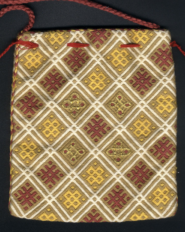
In what seems to be a trend (I like this trend!) I was asked to create a vigil book for Tola. I really wanted to call to mind her work with German brickwork, even though I hate counted embroidery (and do not hate it less for having done this project. Oops.)
The colored parts of the project are worked in splendor silk, using two strands, and all of the white portions in linen thread. In hindsight I wish I had used 3 strands of the silk. The blue and red just don't cover as well as I'd like them to.
I used a pattern from the Hildescheim Cope, found at the most amazing repository for brick stitch patterns, wymarc.com. (Really, visit that website!)
I changed the colors to match Tola's device, and adjusted the positioning so that it could be a vertically symmetrical band on the top and bottom of the book cover.


I left the period of brick stitch in order to create the device itself. It's fairly simple heraldry, but it wouldn't have lent itself well to being worked in a counted way. I also really wanted to use some laid work for the trellis, because it just fit so well. So the yellow base is long satin stitches covered by the blue laid stitches. The outline and yellow circles are split stitches.
The red bit actually is worked in a brick stitch style, because it seemed a good way to tie the motif back in with the borders, but I wish it had covered the white better. I tried three strands, but that felt too bulky, and after I realized that the slightly uneven weave made two strands too little it was too late to really fix anything.

I had a lot of versions of this book that I was aiming for. I know that given all the time in the world I wanted the borders to wrap around to the back, and the background to be filled in, and a laurel wreath on the back. I also knew that probably wouldn't happen in the time I had.
Unfortunately I didn't even get past my first goalpost - the bands on the front and a finished device. (This was at least in part due to losing a week off my working time because of Real Life.) But it is made in such a way that I could finish it even though it's already in book cover form. I especially would love to finish the bands - I didn't think of the fact that the thinner fabric (because it's for counted work!) would show the folds I use to create the cover. It's covered by embroidery in the front, but the back has some very apparently fabric lines.

I learned a lot in working on this book. I went outside my comfort zone, which is a good thing to do. But I also think I was overambitious, which is less good. 
All pictures in the post are courtesy of Tola herself, because I failed to take some before the elevation occurred. 

Thursday, August 31, 2017

Remy's Vigil Book - The Embroidering Part 4

The center of the book cover! While I was working my way through all the goldwork on the main piece, I was also traveling around with this centerpiece. I did not take nearly as many progress shots of this, but it was pretty straightforward.
I started with silk backed with linen (you can see the basting stitches in the lower left corner of the pictures). Because this is white fabric, I could actually put the design directly on the fabric! I sketched the heraldry with a normal pencil, knowing that I would cover all the lines. I then used __________ silk thread in split stitches and filled everything in. The only part that was any more complicated than that was the wolf - in order to stop it from being a blog, I did a bit of silk shading. It's still mostly split stitches, but there are a few stitches that are "whatever fit and moved in the correct direction".

Once the silk portion was done I couched silver passing thread around all the shapes. I didn't want it to be the only non sparkling part of the book cover! This was easy enough to do for the straight lines, but the wolf and fleur-de-lis were rather more difficult. I used tweezers to make particularly sharp bends in the thread where it was needed. I also used a slightly less thick passing thread for those areas.


When the embroidery was done it was time to applique this piece onto the main piece. Pinning it in place didn't work very well - it was very thick - so it ended up slightly lopsided. I used white and blue thread to do the couching, so it wouldn't show. I then couched a looped wire around the outside of the shield. This was to finish covering the couching, as well as to even out the slightly off center shield. I specifically used the looped wire because it called to mind the thread used for the oval of the original piece.

You can also see the many spangles that were added to the piece now. I followed the basic positions of the original piece, but primarily used them in particularly open places in the design. I attached the spangles by used a piece of check purl as a bead to hold them on, which is how they were done on the original piece. Some of the areas around the shield ended up somewhat open, but not in a shape that would easily accept a spangle. In those places I used just a piece of the check purl to fill out the design.

A critique that I've heard of my previous goldwork pieces is that they aren't quite encrusted enough with metal to be properly period. This is a very valid comment - the goldwork that I'm trying to recreate goes far above and beyond what might be considered "tasteful" in our time. Generally I didn't go far enough in the past due to time constraints. This time I was bound and determined not to have any large open spaces! The last two bits of work I had to do before covering the book were also to fulfill that goal.

The space under the swords had been taunting me for some time. I didn't know what I wanted to do, but it certainly needed to be filled. I ended up with a basic design and some spangles there, which turned out fine, but it taught me that the parchment paper I use to transfer my design does more than give me lines to follow. It also keeps the passing thread up above the pile of the velvet, making the lines stand out much more. Now that I know that I'll try to avoid last minute line additions to future projects.

The other item I added was a border. The original piece almost completely filled the cover of the book, and had a border that was actually around the edge of the book cover. In this case the book was slightly larger than the design area, so I decided to put the border closer to the rest of the design and leave the very edge of the cover undecorated.

And now we're essentially done, but it still needs to be put on the actual book!


Friday, August 25, 2017

Remy's Vigil Book - The Embroidering Part 3

With the passing thread and eagle done, it was time to fill in all the empty spaces with bullion.
The gold is the same stuff I used to fill in the majority of the eagle, and the silver differs only in color.
In the original piece the filling was done at a variety of angles. Most often it was a 45 degree angle to the motif, but sometimes it was a straight line across. The most notable of the second type is the wide curling leaves near each corner.

There's not too much to actually say about this step in the process. I find it to be the most pleasant step, although is it repetitive: bring the thread up on one side of the shape, cut the bullion to the appropriate size (the hardest part by far), bring the thread down on the other side of the shape. Repeat ad nauseam. It's meditative, and is very good at flinging little bits of metal everywhere.


I filled in all the gold first, and then all the silver. Then it was onto spangles, which will be in the next post (but you can see they snuck unto the last picture!)


Thursday, August 24, 2017

Remy's Vigil Book - The Embroidering Part 2

Once all of the passing thread was couched down it was time for the worst task: removing the paper used to transfer the design.
I have it down to a bit of a science at this point, but that doesn't make it terribly enjoyable. Using a chenille needle, scratch the paper to rip it. I start with the large open sections, and tear up whatever I can with my fingers once the needle starts the process. If you tear smoothly and slowly a lot of the lines will act as perforations and large chunks will easily be removed. (That part, at least, is satisfying). Next, I drag the needle along the lines in where the pieces are smaller, so they can be removed from the stitches without pulling on the threads too roughly. Once we get down to truly small pieces, tweezers are the way to go. I have some that are bent at the end have a thing and rounded end, so I can use them to poke and grab all sorts of things without damaging the stitches.
But oh, does it take awhile.
It's amazing the difference in how the piece looks once the metal threads are allowed to stand out on the velvet, rather than fading into the white paper, though.


The next item I tackled was the experimental portion of the project. I wanted to pad the Caliver's eagle with felt, which is far more complex a shape than any I've done before.
I experimented on some linen, trying different amounts of padding (all with gold colored felt) and different ways of laying the bullion down to get the right feather effect.
I ended up going with a method that had only the middle parts of the shape padded, with lots of unenclosed areas for feathering. This got a more curved effect than if I had tried to fill the entire shape with felt, and it also gave me some leeway on the edges where I couldn't completely fill the area.
Even with the reduced padding, I found it very difficult to fill the area. The curves were the hardest part - it was simply difficult to change the angles that way I needed to while still covering everything. And so, close up you can see that the bullion is cut quite irregularly, but I think the effect is fine when looking at it from a normal distance. It helps that the bird is maybe an inch and a half tall.
I do particularly like how the ends of the wings and tail worked. I like the little bits of a different bullion for interest, and that they really do end up looking feathery. The tail is also where the padding is most easily seen, unfortunately. I would reshape that if I were to do this again.


Thursday, August 17, 2017

Remy's Vigil Book - The Embroidering Part 1

After finishing the design of the goldwork cover, it was time to start with couching down the lines. The lines were couched using #368 matte gold wyre from Thistle Threads and #5 silver passing thread from Hedgehog Handworks (now out of business). I happened to have both of these threads already, and chose them based on size and quantity, and the fact that I had bullion that matched their color. They were slightly different to work with. The silver was slightly thicker and acted more like metal wire would.
Sometimes I don't take the best pictures of my work, but hopefully you get the idea here.

The lines were somewhat complex to work with. In the original piece, there are two threads that are paired, but often have split apart to go create sub designs, to return to each other. Often they cross over themselves. In order to get all of that straight I printed out a very high resolution corner of the design, and drew arrows on it to follow. Even with one corner blown up to a full 8x11 page there were some more densely crossing areas that ended up being mostly guesswork.

Gold passing thread so close to completed
Because the lines were so complex I wasn't able to actual couch down both threads at once, when they were next to each other. I didn't have two spools of the thread, and couldn't begin to guess how long a second piece would need to be. Instead when separated thread returned to each other I tried to couch the second in the same places as the first, often going over both threads to give the illusion that they were couched at the same time.

Once I had completed all the gold portions - which amounted to four large motifs in the corners, and two smaller ones on each long side - I moved onto the silver. There was much less passing thread to worry about this time, and none of the motifs were particularly complicated. The flower petals were a bit of a pain due to the small loops crossing over each other and generally not wanting to go where I told them to, but it was still nothing compared to the gold motifs.

After the silver was done I outlined the last few objects with sewing thread, just so that I could find them once the paper was removed. This included the eagle, the central shield, and hilts of the swords. All of these were going to be more complicated that just outlined in passing thread, so couldn't be done over the paper.

All the passing thread

Sunday, August 13, 2017

Remy's Vigil Book - The Planning

Remy Delemontagne de Gascogne has a very late period, very French persona. When I was asked to embroider a vigil book for him I went on a quest for items that fit those two requirements.
I found that the Library of France had some gorgeous book covers in EXTREMELY high resolutions.
Seriously, go visit. I'll wait.
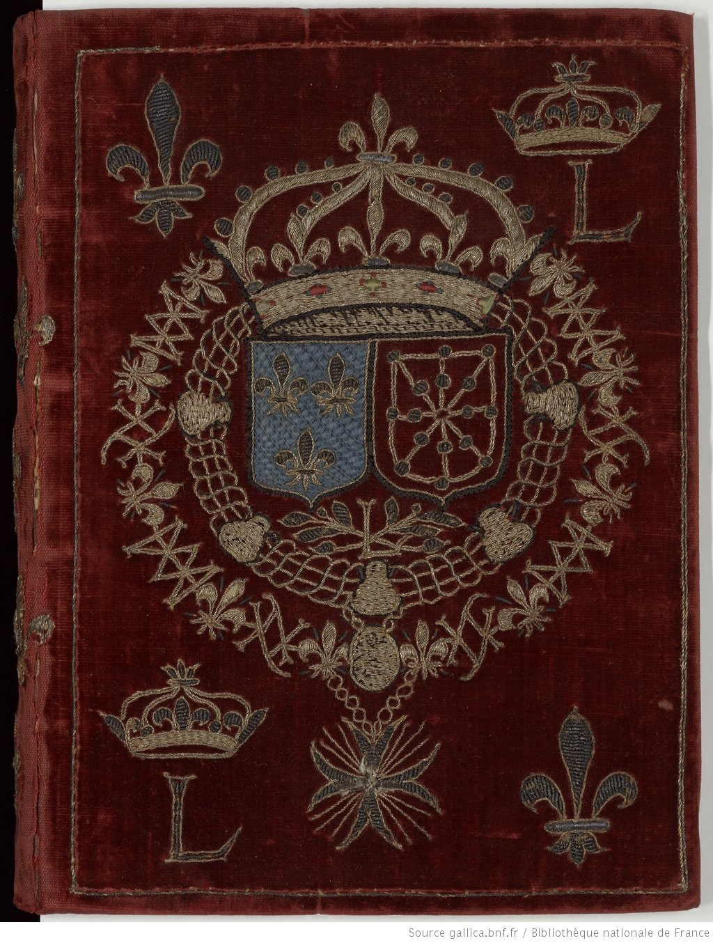
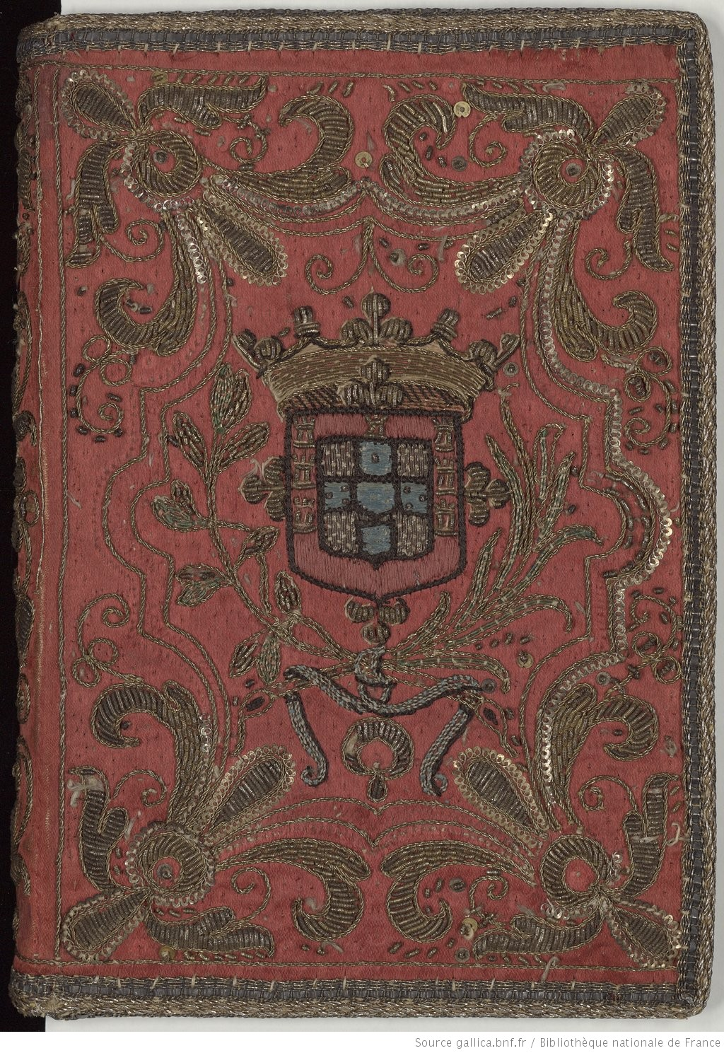
The three embroidered covers that they had were all appropriate to the Cavalier period that Remy prefers. They're a little late for more common SCA A&S, but the style and materials were not appreciably different.

http://reliures.bnf.fr/ark:/12148/cdt9x1j51/?enhttp://reliures.bnf.fr/ark:/12148/cdt9xvg4/?en


http://reliures.bnf.fr/ark:/12148/cdt9x1jmm/?er=2
The purple one to the left is from 1637 ended up being the main source of inspiration. The original design was something that I knew I could add personalization to without too much effort, and without losing the original feel of the piece.

I knew that I needed to add the Order of Defense symbol. I also knew that I wanted to replace the religious imagery in the center with Remy's device. Other ideas that I floated around included the Musketeer symbol, the Carolingian heraldry, and the Carolingian Caliver's eagle. In the end, only the eagle made it into the design.


Both Carolingia and Remy have blue as their primary heraldic color, so I went on a search for blue velvet. I managed to get my hands on some amazing velvet scraps from fabric that had been used to create coronation garb for Thyra II and Edward III.
Similarly to previous velvet based projects, I stretched linen onto my frame and then basted the velvet on top of that so it could be stretched without being crushed. Then I traced the design onto parchment paper and basted that onto the velvet. I knew this would eventually result in the painful process of removing the paper, but it is so much easier to get the initial design down this way.
I tried to place the design so that I could use the selvage edge to make the covering process easier. This mostly worked, but I ended up with a book slightly larger than expected, so the end cover is just a smidge too small, and has a tendency to fall off. This is, luckily, a thing that can be fixed.


Tuesday, July 12, 2016

Vigil Book for Matthias

It's been a busy summer for me!
Once again I was asked to create a vigil book cover - this time for a friend who was getting his Knighthood!

The original design was based on the motifs that were going on a new tunic, also for the occasion. Those motifs were in turn based on the sorts of designs you would often find in German brick stitch as well as Austrian roof tiles.
Image from A Stitch Out of Time
The belt was an obvious choice, this being a knighting and all. No part of me wanted to try to embroider a unicorn in the time allotted to me, so my initial plan was to include shooting stars. Unfortunately I started to run out of time, and ultimately I was worried they would make things too busy, anyway.


I knew purple was a requirement for the ground fabric. I found a wonderful linen - thin enough to make a good cover while still hefty enough for the heavy embroidery I had in mind.
Because of the geometric nature of the design I decided to draw onto parchment paper so I could the lines exactly correct. It was, as usual, a pain to remove, and I'm not certain this time if it was the right route. It's harder to remove the paper from linen than it was from velvet or wool, where the pile helps get the paper off.

All the embroidery is silk - for the belt I used a few shades of Splendor, and the geometric portions were done using a thicker pearl thread that I got at Gulf Wars last year.
Non metal embroidery completed

Silk shading and gold work, while often found together, are not often found with German designs (that I've found. I admit I haven't looked very hard), but I thought it would look good - and would be an easy (in that I'm practiced at those methods) way to get a good looking book.

I'm very happy with how the shading came out - considering I only used three colors, I was worried it would end up too rigid looking. The belt did come out a little...non euclidean. I would change the shape of where it wraps around itself if I went back to do it again.

The biggest problem that I had with this was that the frame wasn't holding the center of the piece as tight as I would want. I had to retighten if regularly, and I still ended up with a lump in the middle of the belt, which you can see in the finished picture below.


For the goldwork I used passed thread as the buckled and the bits inside the geometric areas. I'm very happy with how the buckle came out. The gold on the end of the belt is pearl purl, slightly stretched out. I was originally planning on using normal purl or bullion for that area, but I didn't have any with quite the right color gold to match the passing thread I used. I like the effect, so I'm ok with making the last minute change.
It doesn't really show in the pictures, but the entire belt is outlined in a very thing wire twist, including inside the holes. I think this is most apparent in that the belt seems more smooth in the the final picture than with just the needle painting done.

And finally, the finished product!


Friday, June 3, 2016

Vigil Book for Heather Rose

I was asked to create a girdle book cover for a vigil book. It was my first request for a vigil book, and I was very excited!
Christina Jenevra de Carvalhal created the book itself, and very kindly gave me very detailed directions on how to make a girdle book. Up to this point I had only made your more generic book cover.

The linen that Jenevra chose was very nice to embroider on, although the positioning required by a girdle book was a little bit of a pain. It needed to be right near the bottom to make use of the selvage edge.

I was in a rush for this one, so progress pictures didn't happen with any regularity.

The border is whipped chain stitch with satin stitch hearts. This was very difficult to keep straight in the hoop, but I mostly succeeded. The laurel wreath is also satin stitch. The device is done in split stitch with satin stitch rabbits. I then outlined the hearts and outside lines in gold passing thread. With that done it still looked like something was missing, so I added some very non period flourishes with gold purl. The pieces are a little long, so I'm not entirely sure how some of them will hold up to hard use.
I had measured the the front of the book before starting the embroidery, but it still ended up just a smidge taller than the book. Luckily, on a girdle book that's less of a problem. If this were a normal book cover with the top and bottom folded down, I would have had to do some reworking.

One thing that I didn't think about until it was almost too late was that the book needed a closure of some sort. Jenevra's directions were very clear about designing the embroidery to take a closure into account, but of course I didn't look at those until the embroidery was all done. I ended up braiding some matching floss and attaching it at the spine. It's not the fanciest closure, but it does do the job.
The actual covering of the book could certainly have gone smoother, despite the excellent directions. Part of my trouble was just time crunch, but the rest was a learning experience.

Congratulations, Heather!


Monday, February 8, 2016

King's & Queen's A&S Champs Report

The beginning of my A&S token collection

This past weekend I participated in my first SCA Arts & Sciences competition. And because ...reasons....it just so happened to be King's and Queen's Champs.

I have heard horror stories of A&S competition since I first got into the SCA. It didn't necessarily scare me away from A&S - I just took my time finding something I actually wanted to research - but it did make me extremely wary when I entered into the scene. I'm lucky in that the Eastern embroidery community is generally very supportive of new people, and even when providing criticism they have so far been quite kind to me. But I knew they weren't the only ones I would be interacting with if I started competing.

The competition changes slightly from year to year, but this year is took place in two rounds. The first round was completely closed - the judges went around to the ~30 displays without anyone else present, and you were not able to speak about your pieces. They had to stand on their own. This was very difficult for some people, who had stranger displays or whose writing was not as good. This was nice for my first competition, because I had nothing to be nervous about. There was nothing I could do once my things were set up. (Of course, it means when I'm in a more common competition and have to do a lot of talking it will be like the first time all over again.)
From that round they selected the top scores to move onto the next. They selected seven people. Each of them were given five minutes to talk to judges about their projects and convince the judges that they would be a good champion. I was not one of those people (nor did I expect to be) but several good friends were, and I am very proud of them!

My display was very simple. My gloves were stuffed so they would stand up, and my book was flat on the table. I brought the designs I had sketched and the test pieces I made before each piece, but they weren't labeled or anything. My documentation (gloves and book) was set in front. After seeing other people's displays I have some ideas for how to make things more engaging and visually interesting.

I went to sit with my display as soon as they let me, although I didn't get a lot of questions. I did get a lot of compliments, particularly on the gloves. And since the gloves now look very flawed to me, that was probably a good reminder. One of the judges came by to give me some pointers, which I really appreciated. Although he was trying to translate Embroiderer Speak, so hopefully I'll get to sit down with the judge that was actually in my area soon.

Between my observations and the feedback, next time I should:
  • Have summary docs displayed.
  • Show more process - example threads, glossary. 
  • Describe the test pieces better, point out which stitches and threads are which, encourage handling of them.
  • Bring a  separate table cover to really mark off my space rather than using the expanse of white.
  • Make a display board for the back - maybe the back corner, so that I can still sit behind it. Put a lot of the above bullet points on it, and pretty pictures.
My score ended up being significantly better than I expected, though! 19/25. I was banking on getting a solid C grade and managed significantly better than that.
We were scored on 5 things, each out of 5.

  • Materials - 4 - Entry uses primarily period materials. Substitutions are reasonably explained, appropriate, and justifiable. Information is provided about period materials. Materials are appropriate to period.
  • Methods - 3 - Entry uses or emulates a combination of period and modern techniques. Techniques are justified and explained well in the documentation.
  • Execution and Artistry - 3 - Entry demonstrates a good degree of skill, workmanship, or artistic ability. The item functions as intended and is generally appropriate within its intended time and culture.
  • Depth or Scope - 4 - Piece demonstrates an advanced degree of execution, research, time, or commitment to produce.
  • Documentation - 5 - Excellent documentation. Primary and secondary sources are appropriate. Thought process and decisions are very well explained, document is easy to follow.
And for full posterity, the comments: "Good progression from the first to the second project. Process notes are excellent. Would like to see more fill in the patterns so they look busier."

The Documentation and Depth scores were particularly surprising. I figured my documentation was going to be barely acceptable. Turns out that the SCA does not hold us to the standards of advanced college courses, for which I will be forever thankful.

So I have two directions that I want to take my goldwork from here. On the technique side I want to try some padding. On the research side, I seem to have started a collection of Elizabethan accessories, and I feel like I should just keep adding to that. Combining this would be great, but I suppose I could do multiple things.
I've already started researching sweet bags, but I am open to other accessory ideas!

And in addition to all the A&S that day, there were also awards that went out to several good friends and fellow Handsome Boys. My cadet received a much deserved Queen's Order of Courtesy, and three friends got Maunches. I got to read them all (two were verse, and I think I did ok!). And I managed to keep Liadan from figuring out she was getting a QoC, due in part to her own obliviousness.

It was a good day.

Sunday, February 7, 2016

Embroidered Book Cover - Finished Product

The book cover was finished on Wednesday, giving me a full day of rest before I actually had to bring it to A&S champs (which I'll talk about in a separate post).
I finished the twist border, including a line of gold passing thread along the long sides, just for interest. It's hard to see, even in person, but I like it.
In the end I decided that the red on the flowers was just going to be silk. I was out of steam. I like how it came out. Embroidering directly on the velvet had its challenges - you aren't always going into the fabric where you think you are - so there were some do overs throughout. But the red really adds interest to the piece.
The came actually turning it into a book cover, which I just kind of improvised. All the planning I did at the beginning was make sure the velvet and interfacing were big enough for the final form. I essentially ended up sewing the book into its dress, and it just barely closes. The inside edges are still unfinished - I'm not sure how to finish them without adding too much bulk.  

All in all, I am very happy with how this came out. I want to try more goldwork things.


Wednesday, February 3, 2016

Book Cover - The Embroidering Part 5

I didn't get as much embroidery done at Birka as I may have liked, and I certainly did get any done while sick. But I still think I'll finish...just with fewer embellishments than originally planning. I need to do the veins in the big flowers, and maybe a bit of gold on the long sides of the border (and obviously that last corner) and then I will call it done.

I haven't quite decided how I want to do the flowers. The description suggests that red silk was used but I can't see it that in the pictures I have, and it also looks like purl was involved. I may end up going with straight silk, because it's easiest. But ideally I want to figure out how they were combined.

Documentation for the gloves is done, but I've barely started on the docs for this. Why is A&S Champs this weekend? Aaah.